| BATHFORD PARISH COUNCIL |
|
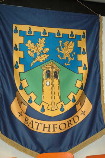
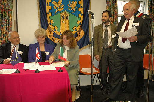
Introduction In 2005 I was approached and asked to design an emblem for the Parish of Bathford in Somerset in connection with the twinning of the village to the French village of Artannes sur Indre. The Twinning Celebration and Signing of the Friendship Charter took place on October, 29th 2005. The pictures show a banner of the emblem in the Parish Hall and the signing of the charter. My thanks go to Maureen Breeze, Chair of the Bathford Twinning Association for the pictures. It should be noted however that the “arms” are in no way official, i.e. granted by Letters Patent from the College of Arms, and are to be regarded only as an emblem of an heraldic nature. They have however been formally adopted by the Parish Council. BlazonPer chevron Azure and Vert in chief a Sprig of Oak and a Dragon rampant in base issuant a representation of Browne’s Folly all within a Bordure embattled Or charged with sixteen Gouttes d’Eau. |
 |
 |
The chevron division of the shield suggests a green hill against a blue sky, representing the local landscape. The sprig of oak represents the rural nature of the area with its flora and fauna in general, it also represents the Browne’s Folly Nature Reserve in particular. |
| CLOWNE PARISH COUNCIL |
|
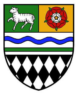
Introduction In early 2008 I was approached and asked to design an emblem for the Parish of Clowne in Derbyshire. After about two dozen different designs with various colour schemes and choices of emblems, the design on the right was adopted by the Parish Council in April 2008. It should be noted however that the “arms” are in no way official, i.e. granted by Letters Patent from the College of Arms, and are to be regarded only as an emblem of an heraldic nature. BlazonPer fess the chief per pale Vert and Or and the base lozengy Argent and Sable on a Fess Argent above a Barrulet Vert another wavy Azure in dexter chief a Lamb passant proper and in sinister chief a a Rose Gules surmounted by another Argent both barbed and seeded proper. |
 Final Design |
 An Early Design |
The black and white diamonds at the bottom of the shield symbolise the geological and industrial history of Clowne. Black diamonds are frequently found in civic heraldry to represent coal or coal mining (c.f. Durham County Council, Eastwood Town Council). These have been combined with white diamonds to represent limestone, the quarrying of which was another traditional industry. Placed at the base of the shield they represent both the geological and industrial foundation on which Clowne has developed. |
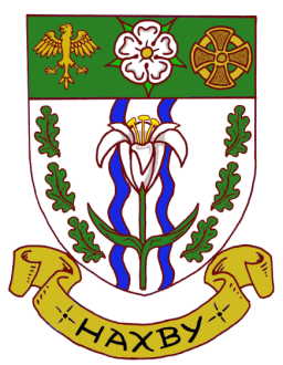
| HAXBY TOWN COUNCIL |
|
In November 2013 I was commissioned by the Town Clerk to design an heraldic emblem for the Haxby Town Council in Yorkshire. After months of working in conjunction with Stephen Newton, a resident of Haxby, the Council formally approved the design on 12th May 2014. It should be noted that the “arms” are in no way official, i.e. granted by Letters Patent from the College of Arms, and are to be regarded only as an emblem of an heraldic nature. ARMS: Argent two Pallets wavy Azure over all a Lily slipped and leaved between six Oak Leaves three and three palewise in orle proper on a Chief Vert between an Eagle displayed and a Viking Cross Or a Rose of the first barbed and seeded also proper. |
 |
|
The main central feature is a White Lily representing St. Mary's, the Parish Church of Haxby. The Lily is set over two vertical blue wavy bands symbolizing the River Foss, which forms part of the Eastern boundary of the town and Westfield Beck which forms part of the Western boundary of the town. At each side are Oak Leafs representing the Royal Forest of Galtres in which, in the Middle Ages, Haxby was located. At the top on a Green field, representing the surrounding natural environment of the town including Haxby Moor, is the White Rose of York. With at either side an Eagle, alluding to Haxby's Roman heritage and a Cross alluding to its Viking heritage. |
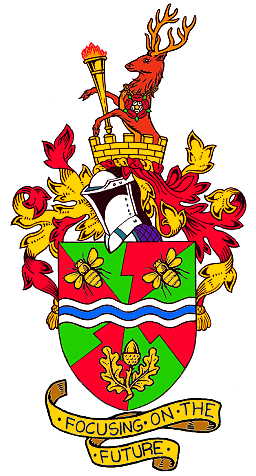
| SHIREBROOK TOWN COUNCIL |
|
In March 2007 I was commissioned by the Town Clerk to design an heraldic emblem for the Shirebrook Town Council in Derbyshire. The Council formally approved the design on 20th June 2007. It should be noted, as with Bathford, that the “arms” are in no way official, i.e. granted by Letters Patent from the College of Arms, and are to be regarded only as an emblem of an heraldic nature. The Council is however interested in having them formally granted by the College of Arms. ARMS: Gyronny bevilled of eight Vert and Gules on Fess wavy Argent a Bar wavy Azure between in chief two Bees volant bendwise and in base an Acorn slipped and leaved all Or. |
 |
|
The red part of the field represents energy, power, success and enthusiasm and the green represents the countryside, nature and the environment. The "bevilled" division lines have the appearance of bolts of lightning giving a further impression of energy and dynamism. All together these represent the urban and rural nature of Shirebrook with modern industries and open spaces in a rural setting. The blue and white wave across the centre of the shield represents a stream. The name of the town has two possible meanings - S.O. Kay, in his "Coronation Handbook" of 1937, opted for "bright, or shining stream", but Kenneth Cameron in his "Place Names of Derbyshire" prefers "boundary brook". Either way the band represents the “brook” part of the name of the town. The bees represent skill, perseverance, activity and industry. They can also be seen as representing a community working together for the common good, their golden colour represents wealth and prosperity. The acorn with its leaves is a further reference to the surrounding countryside with its hedgerows and woods. It also alludes to Stuffynwood and Littlewood to the south of the town. The oak has traditional associations with England and the acorn itself can be seen as representing the “new” Shirebrook growing and developing out of the old. |
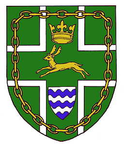
| TOLLARD ROYAL PARISH COUNCIL |
|
In July 2014 I was approached by the Parish Clerk to design an heraldic emblem for the Tollard Royal Parish Council in Wiltshire. After a couple of initial designs, one of which feature a hare rather than a buck, the Council approved the design and added it to their web site http://tollardroyal.com/parish-emblem/. It should be noted that the “arms” are in no way official, i.e. granted by Letters Patent from the College of Arms, and are to be regarded only as an emblem of an heraldic nature. ARMS: Vert a Cross Argent thereon another Cross also Vert charged with a Buck courant between in chief an Ancient Crown Or and in base an Escutcheon barry wavy of six Argent and Azure all within a Chain in orle also Or. |
 |
|
The colours of green and white represent the chalk and downs of the local landscape, and more specifically to Cranborne Chase. They are also the predominate colours in the arms of Wiltshire County Council. The fallow buck represents the royal hunting forest and ties with the image on the logo of the Cranborne Chase AONB. The crown, in the style of Plantagenet kings, is to represent King John who used the area as a royal hunting ground. The white cross represents the church and the shield with wavy white and blue bars represents water, here specifically the village pond. The golden chain has double significance. Firstly a reference to the parish church's dedication to St. Peter ad Vincula ("St Peter in Chains"). Secondly the links represent the individual residents of the village working and forged together as a whole into a strong community. |
|
|
|
|